Our Custom Garneau Team Kit Design Process
We may not be professional cyclists. But, as a team full of professional creatives, we still want to look our best on the bike. Which means kit design is a key part of establishing our team aesthetic.
Our kit design comes from a passion of cycling, and more importantly, a desire to create a sense of community — not just as a team but as members of New York City’s vibrant cycling scene. As a professional designer I wanted to bring that same passion to our kit design, and I’ve found that designing a kit that looks good, well, that’s just the first step.
The biggest challenge with kit development is the production timeline. While kit design is one of the most enjoyable parts of creating a team, between a full-time job, training, working on the web and social content and life off the bike, it always seems to happen last minute. I have been racing for the last eight years on a variety of teams and kit design always seems to take longer than you think it will.
At this point, I basically have used all cycling clothing companies that offer custom kits. I haven’t heard of any manufacturer that can produce custom kits within three weeks – that is, until Garneau nonchalantly told us not to worry about getting the kits in time for Grant’s Tomb. This is just one small example of what you can expect from Garneau as a partner in developing your kit from start to finish.
Here is the story of the process that got us to our New Kit Day.

Finding a meaning
The starting point for any new team is to define its purpose - whether it’s completing a local charity ride or racing competitively in any number of cycling disciplines. Thankfully during the most recent design process our team had a well-defined purpose that was established with the team’s founding several years ago. However, what we were missing was a team identity following our decision to step away from the title sponsorship model instead going with a permanent stand-alone team name. As with all things involving the team it was a democratic decision so we penciled in a team meeting to decide our future name.
Team meetings never happen without a couple of pints of beer and a lot of mostly irrelevant storytelling. Within this particular team meeting, naming was one of the most challenging elements of the process. Everything started at a pub around Union Square - seventeen riders piling around several tables and discussing naming options off the top of their heads over beers. Unsurprisingly the conversation wandered and while we walked away with a long list of names we didn’t get much closer to a decision.

Over the days following the meeting we started a team email chain with the subject line “Team TBD.” As the message thread grew and grew until it spanned a couple hundred messages that same subject line kept popping into our inboxes. At one point, Steve called it out - suggesting that “Team To Be Determined” could be an interesting take on traditional team naming. We laughed about it and went back to the brainstorming.
However, within a couple of days, we started circling back to “To Be Determined.” Maybe it was the fact that we had seen the subject line so many times by then but the name started to stick in the front of our minds. From there we started thinking about the multiple meanings that To Be Determined could bring - both the act of riding with determination on the bike, and bringing an element of uncertainty and adventure back to riding. From there we fell in love with the name and before long the entire team was on board. To Be Determined had been born. Now we just needed kit which matched the name.
Creating To Be Determined's Team Kit
It’s late at night, I’m trying to put together design ideas on paper to share with the team because we are getting awfully close to the racing season.
After some initial sketches, I’m transferring my favorite designs to illustrator with more details so I can present them to the team. Working on these kits is the only reason I’d be up this late on a workday, and I need to wake up early to ride. However, these designs need to get done. The season is getting closer.

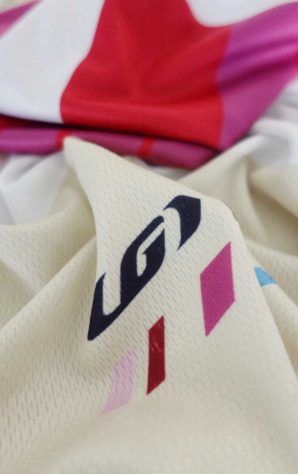
I like designing the kit I race and ride in. After all, we will be wearing this kit six hundred plus hours a year in all manner of conditions and contexts. We, as cyclists, are billboards riding around in Lycra covered in sponsor names. The idea of beautiful design is embedded into cycling culture. We all drool about a new bicycle frame released just before the Tour de France or a new aero helmet that doesn’t make you look like a mushroom.
For jerseys, styles have varied and materials have improved over the decades. Back in the 2000s, some of the designs were so outrageous that I’m pretty happy that we are done with that era. In the last five years, it has seemed to be a competition to see who can get the most attention in the peloton and what kit can be so vibrant so as to be visible from space. I personally have been a victim of this fashion trend as I designed a snow camo with pink details for my old team 6 years ago - which actually happens to be one of my favorite kits to date.

However, even though cats, donuts, fluorescent colors, and galactic stars can work on their own, layering them on top of each other does not necessary mean your designs will be four times as good. Maybe it is just me, but as I get older, I see that my designs are maturing with me - becoming more understated while still aiming to express the vision and philosophy of the team beneath the kit.
My designs start with quick pencil sketches and colors picks. There can be pages and pages of them. I usually share with the team a handful of designs, which I clean up for presentation. As a team, we are a pure democracy. Every decision is presented to the team and voted on, and it is up to the individuals to get involved in the decision-making process. Roger and I presented concepts that we wanted to see as the future TBD kit. The team had split ideas, but we picked the most liked elements from different concepts and combined them. Usually, this process gets messy and this is when most designs get ugly. However, we were laser focused on simplifying the ideas and merging the concepts, ensuring that the final product didn’t wind up as a mish-mash design-by-committee kit.

When designing, the location of the sponsor logos and the relationship of the designs on the front and the back are very important. Visualizing the designs when worn on the bike is the key to a successful kit design. For example, how will the gloves look when rider’s hands are wrapped round the handlebars? We took all of this into account while also striving to capture the team’s philosophy by avoiding huge smatterings of logos all over the jersey - maintaining the understated aesthetic that carries throughout the kit.
It took many, many hours of work, often times late at night. But in the end, and thanks to a big helping hand from Garneau, our new kit design came together not just beautifully, but also on time for our first race of the 2017 season as To Be Determined.
However, there was so much more we wanted to do with our new identity. Once the kit design was completed we turned our focus to developing a portal where we can share our experiences with others and give back to the community. We wanted to create a community where we could share all things bicycles in New York City and around the world. So, that is how tobedetermined.cc was started. Since the launch, it has been one of the main websites within the New York area to read race recaps, look at high quality images, learn about bikepacking, or controversial articles on where the sport is going. The website quickly became just as important as the jersey design in defining who our team is.

Creating a team is a journey. With every journey, there are unknowns and that is what makes them fun. If you are planning on creating your own team, create a community or put together a set of kits for your office ride, do not get intimidated. Everything just starts with an idea and there is a full design team at Garneau to help.
See below for additional tips to help you out on the design process:
Tip 1: Finding inspiration
Where does your inspiration come from? Our team is made up of creative professionals, so the process felt natural. If you are not the “artsy” type, there is still no reason to be intimidated. We live in a world where we are surrounded by constant design inspiration via mediums such as Facebook, Pinterest or Instagram, which are all helpful in getting the creative juices flowing. The design conversation starts with just a couple of images and lines. You can use images, collages, colors, doodles or stick figures. It doesn’t matter what it is, as long as you can communicate what’s in your head. Garneau is also very helpful in bringing your ideas to life. The design and production team can be as hands on as you want. They are always very responsive.
Illustrator file format is used for the design files. Once the designs are sent to the production team, you’ll receive a PDF of your designs in the design templates Garneau uses for production. You will get separate PDFs for each garment and the design will be divided into different fabric panels. It is important to check these files before they are approved. Once approved, there is no turning back.
Tip 2: Keep your files in order
Communication between the team and the custom cycling clothing manufacturer is key. However, as a result of sending emails back and forth, you usually end up with multiple files. Especially, when ordering around 10 pieces of garment and going through up to 2-3 rounds of changes, the files numbers add up quickly. To be able to keep track of these files proper naming is very important. The key is adding a date or the attribute.
for example;
Teamname_round1
Teamname_round1_feedback
Teamname_round2
Tip 3: What is your favourite color
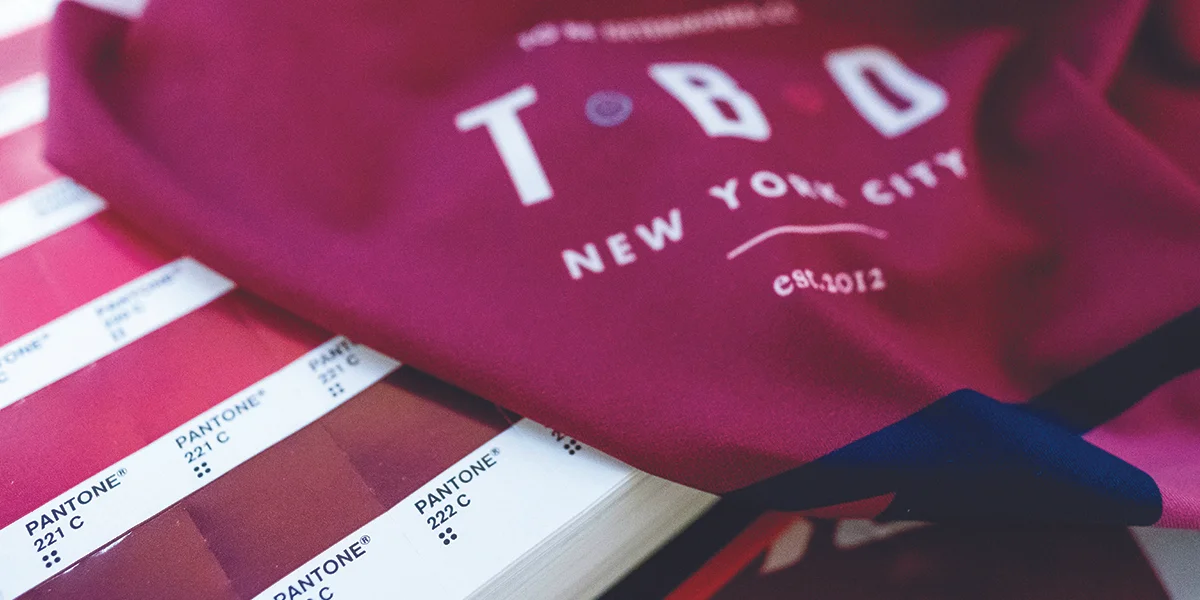
What is your favorite color or your football team? Is there a color that is associated with where you are from? What does your company logo look like? These are great starting points to searching for a color for your team. Our team colors are inherited from when we were called Team Sixcycle years ago. We are proud of what the team has achieved through the years, so we did not want to abandon everything as we were launching tobedetermined.cc. However, we dialed back the presence of the colors to create a more subtle look.
The industry uses Pantone books as standard, and that is the best way to communicate your color selections to manufacturers. Although these colors are standard, their hue changes from screen to screen and print to print. The best way to select colors is to have a pantone book as a reference.
There is always a shift in the colors between different printed mediums as well. What you see on your screen will look different when printed on paper and shift even further when it is printed on fabric. Garneau provides a printed proof on fabric for the final designs for approval before getting into production. When we got the samples back from Garneau, the colors were impressively close the pantone color we provided. Also, if you need a particular color match and you don’t have a pantone book you can send samples of what you want to the Garneau team or even ask the design team for suggestions.
Garneau’s custom program is one of the best offered in the industry. This is actually what really makes Garneau bikes exciting in my opinion. Their hashtag is “#liveyourdream” and honestly they do make your dreams come true. There are different levels of paint options. Most of the colors are offered on their site, but they can accommodate you if you are looking for something special. Garneau team uses PPG colors when it comes to custom colors. Each year, their paint options have been getting better and the chameleon paint job they have done for us or the gradient that they offered in limited runs are very special paints that you can’t get anywhere else.
Tip 4: Print to size
It is hard to visualize how a kit will look when worn. It is always a good idea to print the designs to scale and tape them on to see when they are going to look like when printed. Also, you need to keep in mind that the visibility of the team name and the logos will be different when riding a crit race then standing still in front of the mirror. Make sure to adjust the size of the elements accordingly.

Tip 5: Creating a cohesive look
As I create each piece of garment I compile the finished designs into a different file where I can see them side by side. This is very helpful to see the inconsistencies between the garments and to see if all pieces are working together. After all, you want to have a consistent look as you mix and match the kit.
